In 2007, Matthew James Taylor posted something on his Website that changed the way Web Developers and Web Designers approached the development of layouts. He came up with a truly pure liquid layout that worked perfectly on all browsers, used no hacks nor workarounds, and was XHTML valid.
As an exercise in diving back into Web development, I decided to code his Perfect Liquid Layout (Holy Grail) from scratch. The following is nothing really advanced, but a great refresher.
Of course the very first place to start is to put in the basic HTML structure and add in the basic CSS to eliminate the different browser's default padding and margin and the old IE borders. Might as well add in the 100% width to the body too.

This can be put in a CSS template for future use instead of writing the same code over and over again.
The next step, setting up the nested div structure, refering to Matthew's page. Header, footer, and the columns (with the containers). It's really not complicated. There is an extra Class to add to the main container (colmask) for various settings (see later) which we'll name "threecol".
This is pretty much the only thing required in the HTML file for the layout itself, else than your own content.

The rest is going to be added in the CSS file. First thing, if you feel like it you can add a min-width in the CSS for the body. It's not necessarly required, but can be pretty useful depending on your layout.
The header and footer only requires three things. Clear both left and right, float the left, and set the width to be 100%.

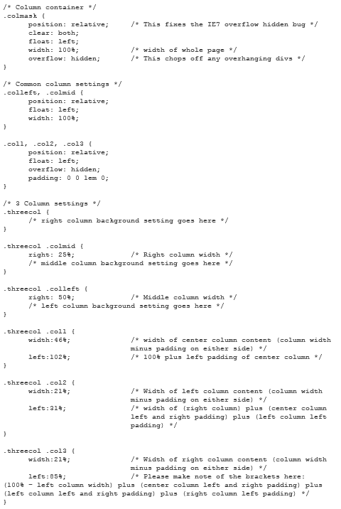
Working with the columns is a bit tricky. It's not complicated, but there's a lot of stuff to keep in mind. Instead of explaining things as I go along, here's the code.

Essentially, that's it. You then just add your own styling to the layout.
This is a pure liquid layout that uses percentage width, resulting in a true liquid layout. I will later work on the fixed [pixel] width liquid layout and post it here. There are some differences in the way the containers (nested div) work.


