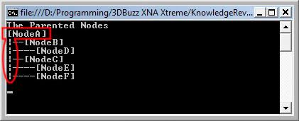
The addition of the vertical bars (aka the broken bar character) at the beginning of any line that's not at the root created what I consider a problem. It can be very misleading, especially if you're checking the DAG for the first time. It's bothering me to the point where I feel I have to change it. There are three options.
The original 3DBuzz design
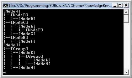
This is the way it's done in the videos. There are no vertical bars at all, so the only visual queue of the depth of a child to its parent are the dashes. It's simple, but on the down side I feel it's not good looking enough.
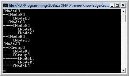
Option #1 - Simple Design
A simple layout of the Nodes similar to the original design, but without any dashes going through the full line until it's child. They're just below the parent. Another very simple design, but there's not a lot of vertical depth. By that I mean that if Parent1 has a lot of childs, there's not a lot of visual vertical reference between Parent1 and Parent2.
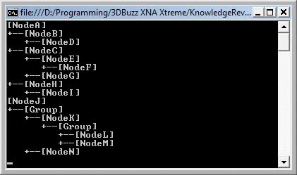
Option #2 - Technical Design
This layout is much more complex visually. It looks very technical, but everything is represented. You can follow each parent and child visually. However, it can be extremely busy on screen.
((EDIT: I just found out how to use Extended ASCII and Unicode in a console application in C#, so imagine the above screenshot but with much smoother lines))
Don't change anything
Stick with the current design even though it can be very misleading.
Essentially, it's a battle between visual simplicity, great aesthetics, and functionality.
There's a Poll on the right. Go vote now!